|

|
Just before I left Japan to start my post
at MIT, I was honored with an exhibition at the Ginza Graphic Gallery
mounted in the upper and lower levels of the gallery. A total of
15 PowerBooks (a then unheard of number) were placed alongside 50
offset-printed images to emphasize the title "John Maeda: Kami
to Computer"
which translates to "John Maeda: Paper and Computer" with
an intended pun of the
Japanese word kami as phonetically meaning "paper" or "god
(spirit)."
At the time, the web was just taking off as
an expressive medium, and all of my experiments in print and computing
began to serve as useful blueprints for an incredibly talented younger
generation. I could see quite clearly what was coming, and this
exhibition was my attempt to put a definitive ending on my line
of thinking.
>Upper and Lower Levels, Ginza Graphic
Gallery in Tokyo


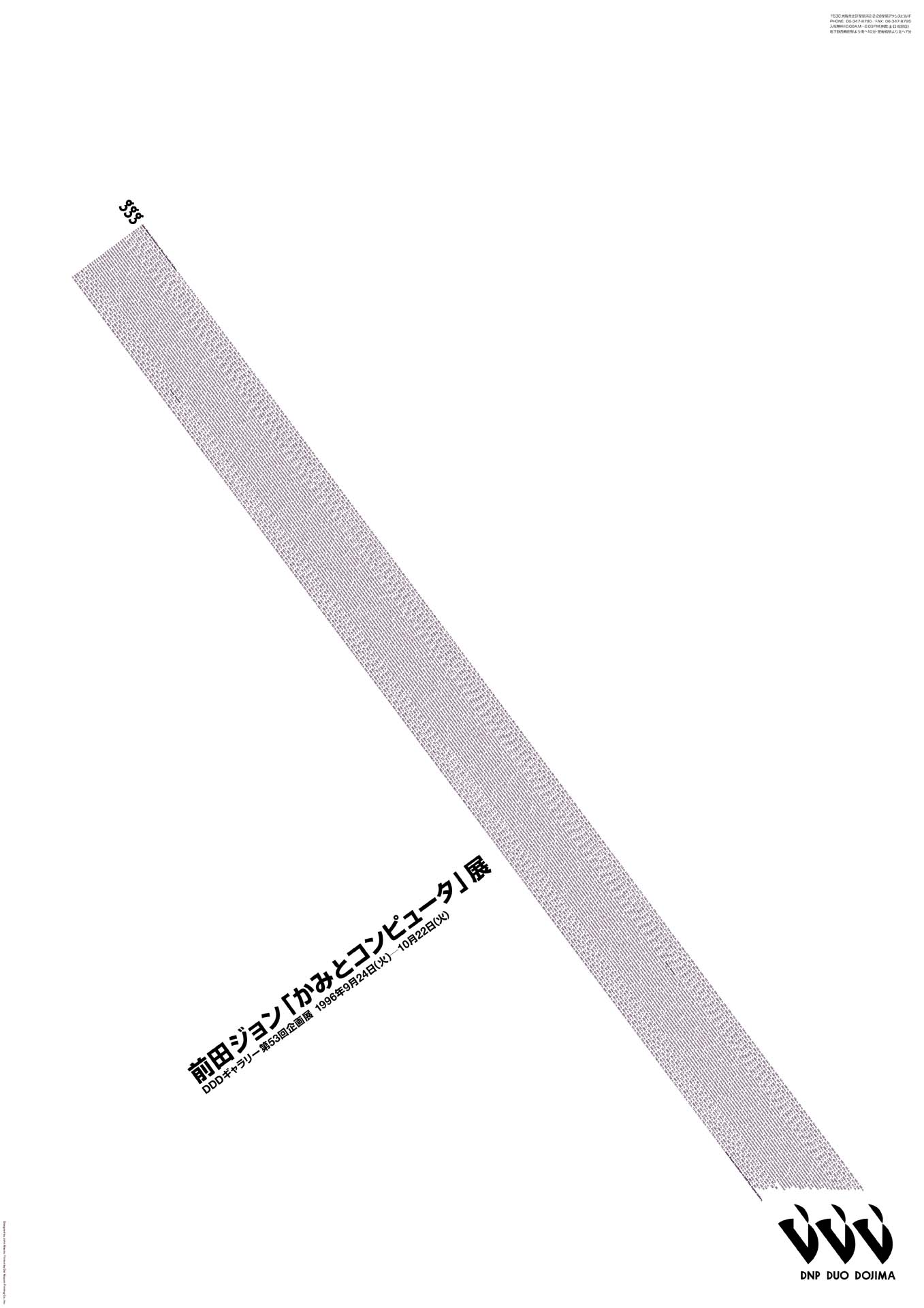
>Exhibition Poster for the Tokyo Showing

>Exhibition Poster for the Osaka Showing

> Lithograph Overview
The following images were rendered in 1997
for the web and thus are low quality ones (my apologies). I hope
to get around to re-rendering these at high-res for download. They
are
all printed
in my MAEDA@MEDIA
book.
We will be offering these limited edition
lithographs (only 2 to 10 in existence per imprint) to the public
to raise money for relief in Asia until February 1, 2005. They all
measure 728mm by 1030mm untrimmed, printed on Vent Nouveau stock
in 2 to 5 colors, depending upon image. Where I have
no more copies, the images are listed as N/A.
(Links from the icons below seem to work
best from the Firefox browser as I am using Javascript ...) • Infinity (A1—A1
N/A)
Everything
started with infinity. A simple diagram of 10,000 gently repeating
loops with 0.1 point linewidths on silver paper.

• Morisawa 10 (B1 through B10)
Ten interpretations
of the Kana letters 'mo,' 'ri,' 'sa,' and 'wa' in black and white.
I was essentially tired of seeing all kind of typographic imagery
so in 1996 I declared an end to it all by
doing it all.
         
• Shape of Space Series (C1 through
C7)
The implicit
shape of a surrounding space as a reading of densities.
      
• Dot Rectangles
Series (D1 through D4)
Using
10 variations of graduated dots, I thought of a variety of regimented
and simple arrangements of these elements. Background black is printed
in double-hit black.
   
• Four Color
Series (E1 through E3—E1 N/A)
Printing
experiment using Cyan, Magenta, Yellow, and Black to create extremely
precise illustrations.
  
• Time Text Series (D1 through D4—D4
N/A)
Using
extremely tiny type (0.5pt to 2pt) to create dense images that represent
temporal phenomena. In one of them is the entire sequence of days
in 2000 years, another the incremental steps towards a marathon, and
in another the seconds in a day.
   
• Color Kokeshi (E1 through E3—all N/A)
Every
DIC Color Chip (the Japanese equivalent of Pantone chips) rendered
as a little, happy Japanese doll. The entire image exists as 3 separate
landscape images.
   
• .Too Markers (F1 through F2—F2 N/A)
The Rolls-Royce
of xylene-based markers (exquisite colors!) is the .Too Copic Marker.
I created a variety of images using the color marker cap (which has
a unique aesthetic), such as the Mona Lisa for the sake of being cliché.
 
• Flags (G1 through G2—G2 N/A)
Flags
of the nations of the world rendered in an image of totality (minus
26.5 degrees of void). I was surprised how many nations exist and
disappear in the world's history.
 
• Grapac (H1 through H4)
The series
of prints that I created were all printed courtesy of Grapac Corporation's
Mr. Watanabe. I created a variety of initial test images using Grapac's
composition press (in the day, large format color printing wasn't
possible). Since it was a real printing press, I could use silver
and fluorescent inks.
   
• Mr. B (J1 through J2)
Created
for a paper launch in Japan, but became an obsession with the instability
of a little mathematical function I wrote.
 
• Shape of Color (K1 through K4—K1 N/A)
Nothing
out of the ordinary, but an emphasis on color and printing accuracy
was the goal. Double-hit colors make these images striking in real
life.
   
• Seibu (L1 through L3—L2 N/A)
Created
for Seibu Department Store in Tokyo as summer imagery.
  
• Sony (M1—M1 N/A)
Created
for a project in collaboration with Sony Tokyo Design Center in 1996
presented at Siggraph that year. Every Sony product printed in a geometrically
repeating pattern .

• Shiseido Anniversary (N1—N1 N/A)
Commemorating
30 years of commercial films for Shiseido, I created an image
that embodied the combined footage in an abstract collage that
was inspired by a sketch I saw on the subway by Tadao Ando.

|

)
)

)
)
)
)